
A layout trick
Written by Kushagra Gour
April 04, 2016 — 3 Min Read | 0 Comments
Few weeks ago, we did a redesign of our product - VWO. It wasn't a complete overhaul from scratch, but some major design decisions were taken in the existing design based on the feedback we have received from users since we launched v3.0. This post is about a cool trick we used to achieve a task in that redesign project.
The task (or issue)
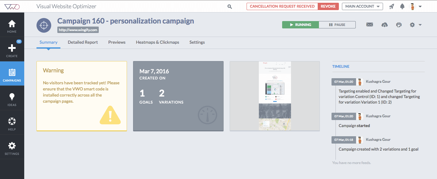
One of the most principle decisions we made was regarding the main layout of the app. It wasn't about changes in placement of content, but actually about the UI semantics. It mostly translated to color changes to bring a sense of how any screen in the app is structured and how all components on the page relate to each other. Here is a comparison of the before & after designs:
Old Design
New Design
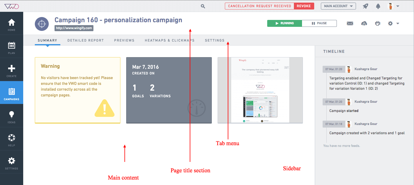
Note in the new design how different sections on the screen are more distinguished with definite boundaries and background in contrast to old design where all the page content was on a single grey surface. The old design reflected in the architecture as well - every main module got the complete page structure (except the main top header and left navigation) along with it. Eg. A Campaign module (page) in the above screenshot comprises markup of the page title section, tab menu, main content and sidebar. What I am trying to put forth is that a transition between modules causes the complete module content (mentioned sections) to disappear and appear again. This was fine with old design as we need to keep the base layout (the single grey surface) intact and custom content can transition over it. But the new design bought an issue with this approach. The base layout was no more just a single grey surface, rather it got split into 4 separate distinguishable sections:
- white page title section
- grey tab menu
- white main content section
- grey sidebar
And all these section's markup being part of every main module's markup, would fade in/out during page transitions which was unacceptable as the common page layout (white grey sections) would itself keep getting fade in/out along with the custom content inside them - bad experience!
The "Trick"
The most trivial approach to retaining the page layout sections during transitions would have been to create those sections in the main markup instead of every module bringing its own 4 sections. And every module change would have simply substituted appropriate custom content inside those constant 4 sections on the page. But this would have meant a major change in the module architecture increasing the scope of the redesign project. Heres how we tackled this issue...
We used the above mentioned solution but instead of dividing the content into 4 sections at root level, we created an illusion of having 4 sections always present on the page - using pseudo element & background gradients! Heres how:
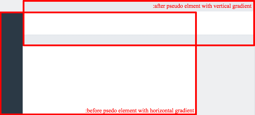
So basically the pseudo structure always stays on the screen with all the custom content going and coming over it and giving an illusion that custom content renders inside those sections - just what we wanted for the end user!
Final result and code
In the End
This trick (or hack as one may call) helped us achieve the desired UX without actually modifying the base module architecture and it has been working really great so far without any compromises made. Hacks are not always bad after all...its just about evaluating what is best when.